
Five Reasons I Use Color Palettes in My Paintings
I’m a bit of a color nerd. That’s not to say that I know everything there is to know about color theory, or that I can recite all the rules to the letter (although I have definitely annoyed enough family and friends with my color rants in everyday life - thank you guys for not disowning me!). But color is a particular source of joy and inspiration for me, and I find it helps so much when I give it special attention in my own art - especially in the form of color palettes. So, I wanted to share five reasons why I love using palettes, and how you can incorporate them in your own work!
#1 - Color Palettes are Excellent Inspiration
Whether you have an idea of what you want to paint or you’re staring at a blank canvas, color palettes can help you find the direction you need.
So, let’s tackle the big question: how do you come up with a color palette?
For me, the inspiration usually comes from nature. If there is a beautiful sunset or a striking landscape, I’ll try to break it down into a color palette. I find this is the best way to handle that feeling at the intersection of “ahh this is so pretty!” and “my phone can’t get a good picture of this!”
Of course, inspiration striking is somewhat random - which is most inconvenient when you want to produce art consistently. Thankfully, with the interwebs there are plenty of ways to actively search for and create color palettes without waiting for the momentous spark. I recently discovered Coolors.co, which allows you to create your own color palettes, browse existing palettes, or even upload a photo and have the site create a resulting palette. Pinterest is also an option, and there are many other awesome tools out there. I even made a color palette based on my followers’ favorite colors to celebrate my 100-follower milestone on Instagram, and I still love how that piece came out!


However you make your palette, it’s a great way to get the creative juices flowing.
#2 - Evoke a Mood
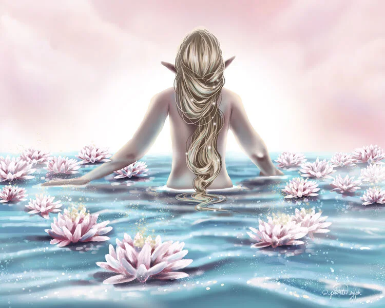
As you are making your color palette (or are searching for one that inspires you), your selections can help set or recreate a mood. I love using the softness of pastel colors to create a peaceful, hazy, ethereal atmosphere, or the golds of a summer sunset palette to evoke the feeling of warm light as the day begins to wind down.

You can always turn to color theory for this too - using colors that are similar to each other (e.g., blues and greens) is generally calm and pleasing to the eye, while using colors that are very different from each other (e.g., blue and orange) can create striking contrast that really makes the painting feel more active and dynamic. However, don’t worry too much about all the “rules” - I think people, and especially artists, are already somewhat tuned in to the emotional side of color!
#3 - Create Unity and Harmony in a Painting
Have you ever created a background for your subject and found it felt disjointed, or like your character was placed in front of a green screen? Using similar colors across the entirety of your piece can help make sure everything is tied together and feels like it exists in the same space. If you have a color palette handy, it allows you to easily pick colors you’ve already used elsewhere in the painting and use them in other places. This is a super easy way to create harmony!
I like to put my color palette in a separate layer in the upper right of my piece. That way, I can easily color-pick the exact color I need.


Why can’t you just color-pick from an area you’ve already painted? That brings me to my next point...
#4 - Avoid Muddy Digital Paintings
Muddy colors in artwork can be attributed to a lot of different things, but one major culprit stems from the color theory phenomenon that all colors mixed together create a neutral, often poop-like brownish color (ahem, yes, that is the technical definition). For you other color theory nerds, I hear you - black, not brown, is the result of all colors combined - but that is in a perfect setting, and you are likely not going to land on that in your color-mixing experiments without some intentionality. Anything shy of that is grayish-brown yuck.
This was the bane of my traditional painting existence: that moment when you had a vomit-colored blob on your palette and you had to decide whether to scrap it entirely or keep trying to fix it (usually the former).
With digital painting, the culprit behind muddy colors is much more subtle. If you blend colors by color-picking, or adjust the opacity, or use a feathered brush of any kind, you are essentially mixing colors directly on the canvas. You are layering color on top of color, and this usually means you are moving ever-so-slightly towards a more neutral color. This is especially true if you are working with lowered opacities, where you are already laying down a less-saturated (i.e., more gray) version of your color.
This isn’t necessarily a bad thing! In fact, it’s pretty normal for color mixing. However, color-picking from within your painting too much will result in already-blended colors being transferred across your painting - do this a couple times, and the muddiness is compounded.
Having your color palette handy allows you to go directly back to the source and pick up the pure version of your original color. This allows a fresh re-introduction of that color to your painting without it being affected by any of the mixing thus far, which keeps your colors clean and...well, not-muddy.
#5 - Prevent Last-Minute Color Decisions
Don’t get me wrong, some spontaneity in a painting is good. Last-minute decisions or inspiration sometimes produce the most awesome results, and digital painting is really great at accommodating these spur-of-the moment experiments (I discuss that in my post about how digital art helped me paint more). But sometimes the well-intentioned spontaneity is...not what we expected. It’s more a game of chance than anything else - fun to play, but you have to be prepared to lose.
I think this happened to me in my recent Northern Lights painting (below left), which I didn’t establish a color palette for. I was unsure what color I wanted to paint the subject’s skin, and I ended up doing some random color picking and winging it. I’m not totally dissatisfied with the result, but it took a LOT of finagling and color-adjusting to get it to where I wanted it. I think a more defined color palette and a bit of foresight could have really helped.


The same goes with the fairy and firefly painting above. This is an “older” piece from July 2020 (wow, it feels like I’ve come so far since then!). I still love the concept, and am pretty happy with the composition and line work. However, the colors do not jive well. I didn’t think them through, and remember messing around with them a lot to try to make something - anything - work. This piece has no clear mood or feeling, there is very little color unity, and it’s just...a bit off. I think some more thorough color planning could have taken this piece from “that’s nice” to “whoa!”
So there you have it: my top five reasons for using color palettes. I don’t use them for every piece - and don’t want you to feel like you have to either! - but I find some definite benefits when I do use them, and like to keep the principles in mind even when I don’t. Hopefully I have given you some new tools or inspiration for when you incorporate color into your next piece. Happy creating!


Planning has a role in art, even if it seems dull. See what DTIYS challenges can teach you about how to do it effectively!